Ikebukuro is now a sacred place for anime otaku with various anime stores and also home to many authentic cosplayers, such as the “Ikebukuro Halloween Cosplay”. Many of these cosplayers also make their own costumes and equipment.
Although there are many places to express cosplay, the creation of these costumes is done at home while re- searching on the Internet. So, I want to make A place to create cosplay and other secondary works.
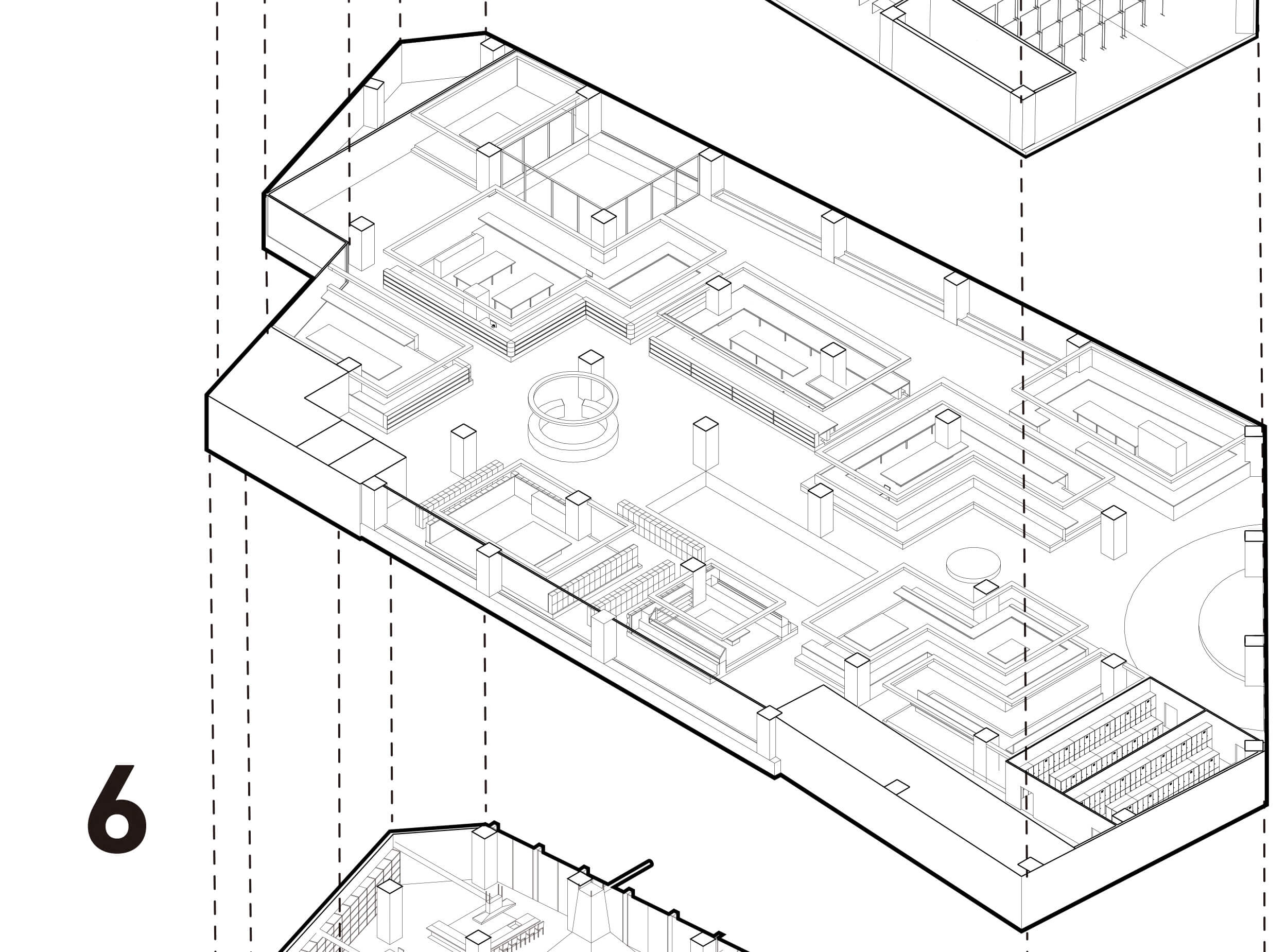
Firstly, I suggest 10 types of places for secondary cre- ation, For example, Cutting area, sawing area, 3D print- er area and so on. These places are painted in yellow. We can do the whole cosplay creation in this floor, as well figure, illustration and manga creation.
The working space is 300mm higher than the other area. Since most of the work is done sitted, the aim is to keep the line of sight between the person working and the person standing in the other space.
Let’ s image that you want to be Tanjiro. You have to do this in three steps. Clothes, objects like sord, and make- up. When you create on this floor, the process proceeds in the order of these three arrows here on the right.
I went to Ikebukuro to observe the activities of various otaku. Beside the creation area, there are five different types activities which I looked. (1) Cosplay shooting area. A curtain can be used as a background. The aisle is wide enough to take pictures. (2) Large poster area. we can take a picture with your favorite character. The poster can be printed at the printer area next door. (3) Manga area. There are manga on the shelves for you to read with your coffee. (4) Flea market area. The bench is wider and can be used to place items. (5) GachaGa- cha area. it is near the elevator and escalator. so we can access easily.
Hence, the edges of the creation area host additional programs. (a) Manga shelf. Three shelves are provided for storing manga while displaying them. (b) Cosplay shooting edge. There is a curtain for the background of the cosplay shooting. (c) Flea market area’s. The width of the bench is 1000mm so that products can be spread out.
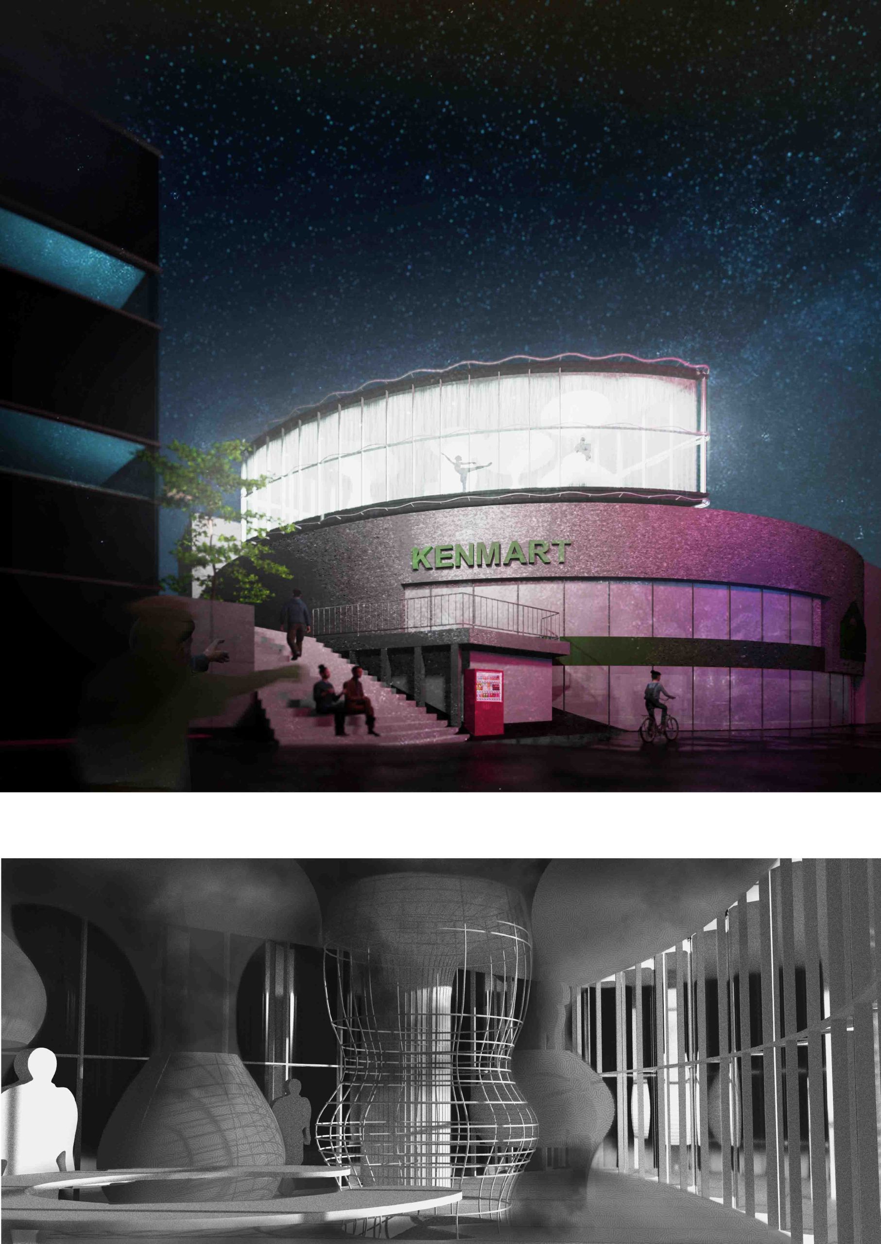
Studio is cross-sectionally connected to the upper floor, which has the re-clothe center. In that manner, we share the studio and held event about cloth and cosplay.
Of course, this floor is mainly used by Otaku, but there are some great facilities here. So, architecture students can use 3D printers, wife can sew, and so on. There are also cafes in easily accessible locations, so some people will feel free to stop by. I strongly hope that the cre- ations and techniques of otaku are not only for otaku, but that they can be passed on to other people as well.
COSPLAY AND REFLEXIVITY
Anthony Giddens proposed the idea of “reflexivity” from the perspective of sociology. It means “a spiral- ing cycle of transferring oneself to others, which then returns to oneself and transforms oneself. The act of cosplaying is to become “someone else” and to en- ter the “otaku society” including the cosplay society. And within that otaku society, they are recursively ex- pressing themselves.
Some people who engage in cosplay do so for the pur- pose of escaping the “real world” that is not otaku so- ciety. This is similar to what is called “identification” in psychology. Identification is the act of trying to escape anxiety and pain by superimposing oneself with things that are important to one. It is also based on a lack of self-confidence and a desire to become a person whose complexes have been resolved.
However, self-expression in otaku society can also have a reflexive effect on the real world. For example, in or- der to become more like a character in cosplay, one may start to pay more attention to skin care and style, or learn to be more social in a cosplay society with many rules. Through the reflexive nature of cosplay society, we can gain a reflexive nature with the real world.
And cosplay is a place where the “place of presen- tation” is socialized, and its creation stage is black boxed. On the other hand, the techniques used to create cosplay are actually very advanced. For ex- ample, the swords used in cosplay are made to be lightweight and the materials used are ingenious so that they do not become tiring to hold during long events. However, there is no place to learn these tech- niques, so cosplayers learn how to make them from the Internet or by giving each other advice on how to make cosplays at events where they are presented.
The purpose of this proposal is to bundle and make public the cosplay creation techniques that have been closed and not made public until now.
What’s important about this proposal is that the work- ing area is open to more than just cosplayers. This will be a place where the behavior of “creation” will be shared, centering on the cosplay creators.