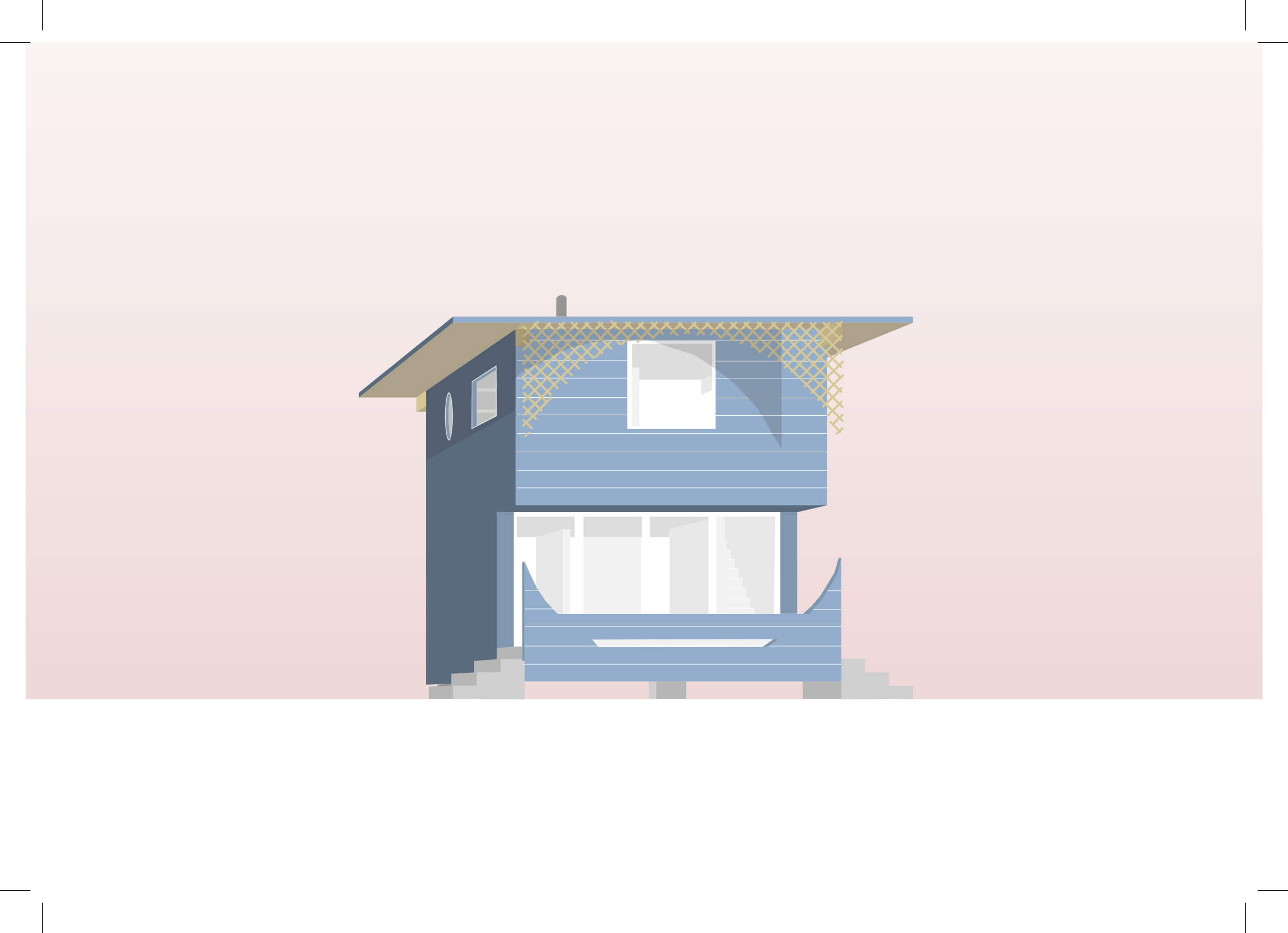
Reading Hersey House-an unbuilt project by Robert Venturi for a beach house with no particular plot-we be came fascinated by the way this small house pretends to be bigger with its thin extended roof, hiding its smallness behind a projecting porch with a big cutout circle. In our project inspired by Hersey House, we aimed to keep and reinterpret the thin roof, making it almost as big as possible, but shifting it from its central position, in order to create different spaces underneath.
We kept the clearly defined orientation of the house, designing its entrance on the opposite side to the general approach, in a way similar to Hersey House.
Looking at the plan, all rooms are set to one side, leaving room for one big open space, but unlike in Hersey house, we decided to continue this openness into the second floor, creating a loft-like space.
We reinterpreted the porch or second skin, as we like to call it, by a wooden mesh-like construction with a cantilever behind, in order to create a parking space necessary in Tokyo’s urban context and also in order to provide a somewhat playful reference to House in Uehara house by Kazuo Shinohara, situated just a few doors away.
Lastly, we decided to keep the stilts of Hersey House and adjust them to our sloping terrain, because we thought of them as characteristic of Hersey’s image. Moreover, put ting the house up on legs gives a certain hint about its origin, suggesting that it came from somewhere else.
Teacher: Kersten GEERS
Varga-Brigio Medical Office Building
The large wedge-shaped volume affords a stunning approach to the building that visually and physically draws the visitor from front to back. The narrow Tokyo lot next to Kazuo Shinohara’s Higashi-Tamagawa House and later Complex does not allow for this sort of sweeping approach. Adapting this building for the Tokyo site thus required an entirely different method of emphasis. In this case, we were interested in the form of the building itself and inspired by the perspective created when we analyzed its approach.
Other aspects reflect ideas from the original building, such as the semicircular entrance and windows stemming from interior function. At the same time, the neighboring Shinohara building inspired our overall form and the arrangement of apertures.
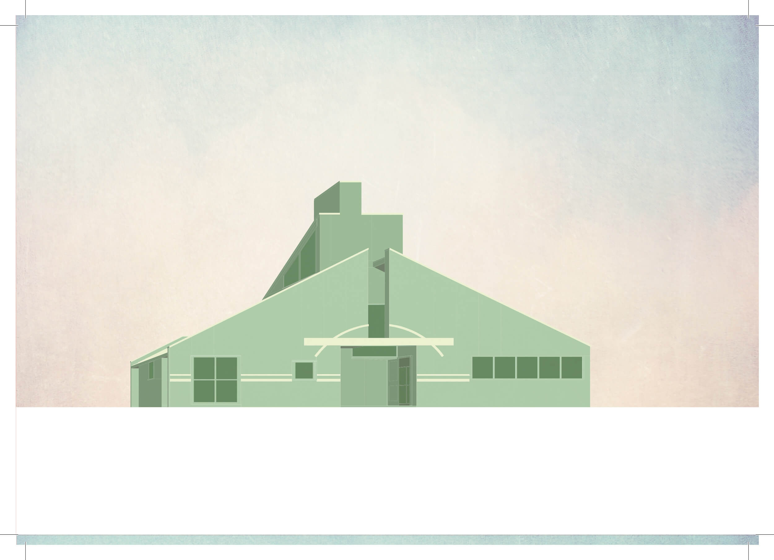
Frug House
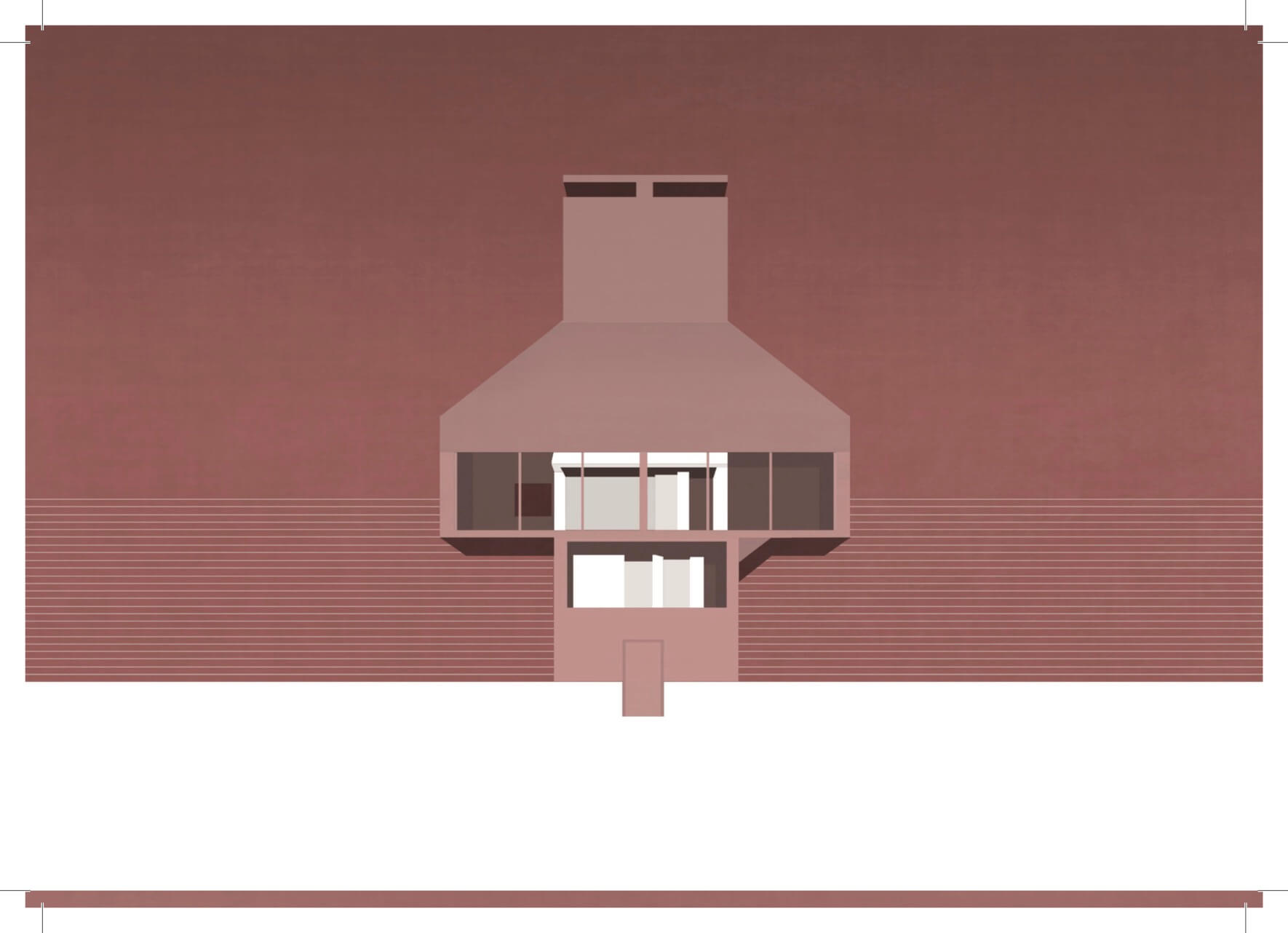
Both the Frog House and the Gae House played important roles in shaping our design. Generally speking, these two projects can be respectively described as either a chimney with two facades or else a building with a big roof.
The main concept from the Frug House is its ambiguity, with its two facades, or faces. One on these is symmetrical and open, with large “eyes”, and the other is dug-in and shows the complex interior of the house with its various shapes and materials. Both these faces are emphasized in our perspectives. The chimney is kept because of its important position in the Frug House as well as for the design limitations and possibilities it creates. Our idea of a big roof is connected with Bow-Wow’s Gae House. Here, the roof pitch was determined by local regulations in this mostly residential area. The large-size front window makes the house more difficult to “perceive”, and this idea can be traced in both the Frug House and the Gae House.
The foursquare plan derives from the traditional Japanese “ta” character for the shape of a rice field; it consists of a simple division of the square-shaped plan into four equal quadrants. Both staircase and chimney are set in the same quadrant, forcing the stairs to dance round the chimney on the way up or down.
In our pespectives we reveal the ambiguity of our design. The symmetrical facade with its large window and hat-like roof that imitates a typical house shape dominates the first one. The second shows the playful asymmetrical backside.
2013_Without Venturi
Kersten Geers, 2013
text
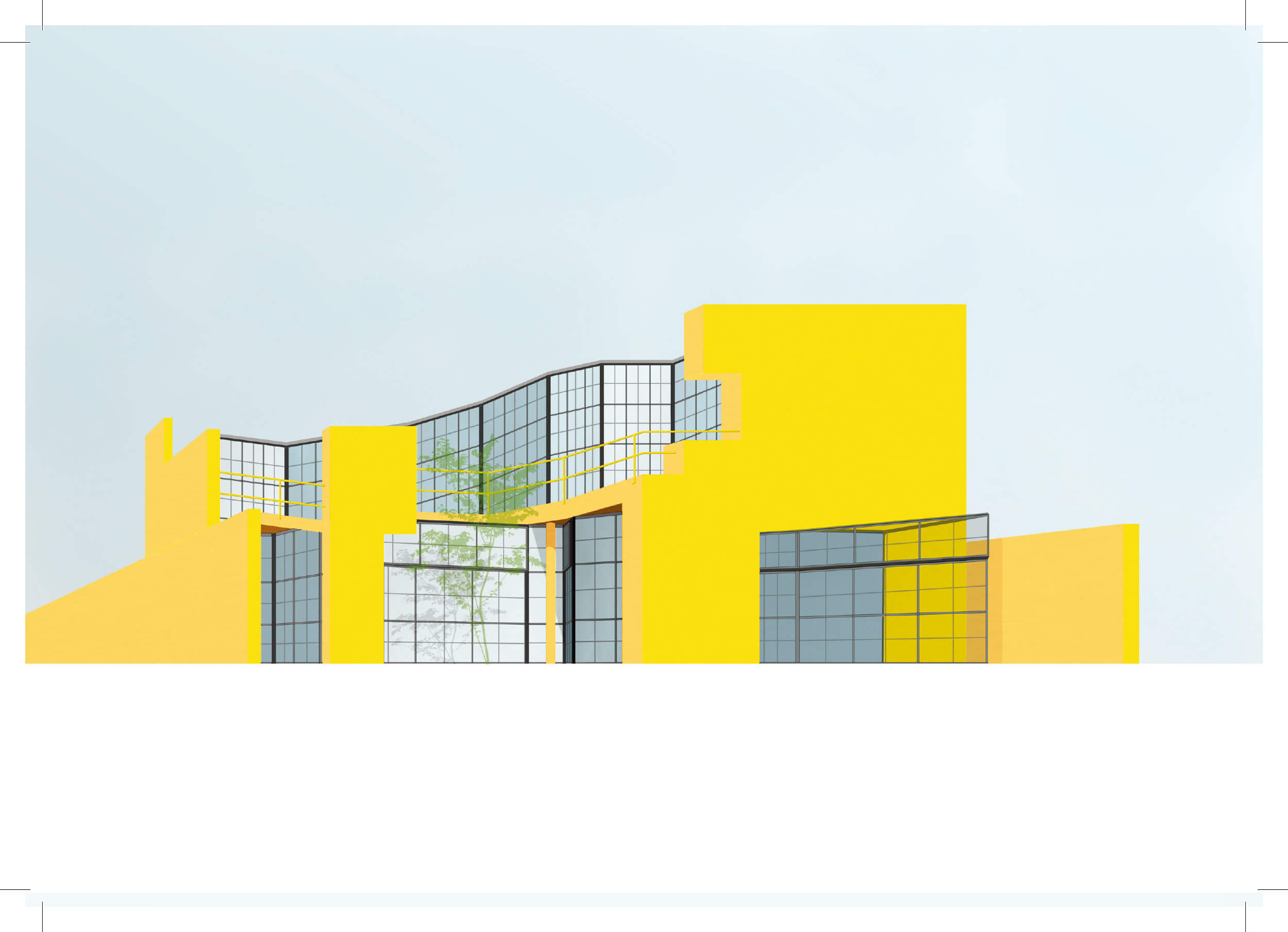
Wike House
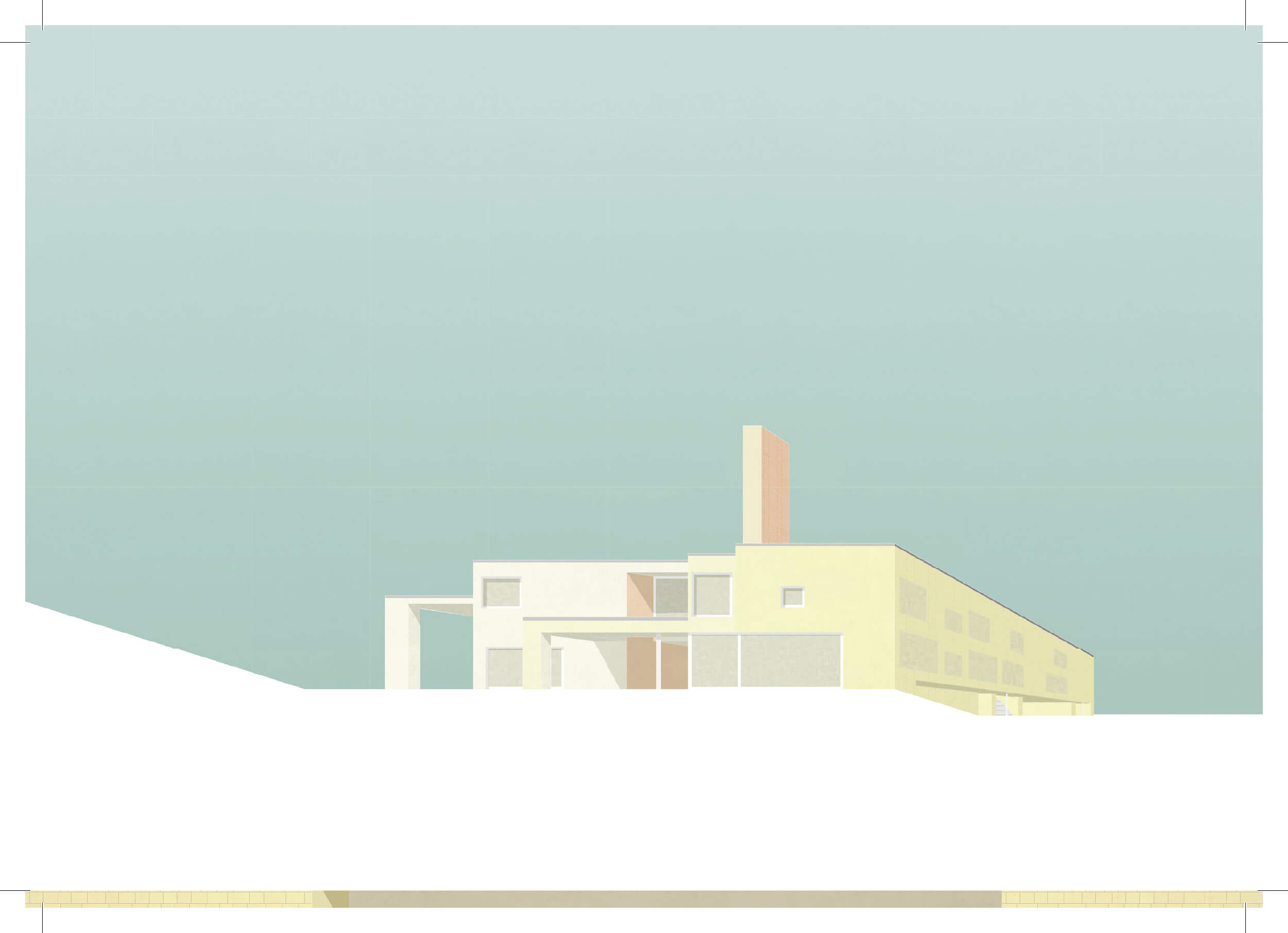
How can we use the Wike House project by Robert Venturi, to think of a building that incorporates a specific program fitting a designated site in a totally opposed context – Tokyo? The intention of this idea seems, for many to be arbitrary. We do not think so. The suburban context in which most of Robert Venturi’s are located and the very visual play with these contextual elements can also be found in the undesigned environment of contemporary Tokyo. We extracted three conditions from the Wike House, each of which interested us: two houses in one – guesthouse vs. owner; secret garden, since what is behind this house is unknown and front vs. back
Starting from here the main question was: How does Venturi’s design deal with these conditions and how can we apply them in our version. The volume of our design forms an L-shape in order to create a peripheral block-like courtyard (or secret garden). The two programmatic volumes are separated on the entrance level to enable a sneak peek into the garden from the street. On the upper floors, the two parts (actually two distinct houses) are connected, creating a bridge like appearance in the volume. As in the Wike House, the appearance and setup of our two main facades are quite different. Our proposal suggests an ordinary (for Tokyo) street facade and an open court facade. The relation front vs. back is, as in Venturi’s design, not merely an abstract idea, but an actual structural fact. The construction of the outer skin in concrete with recessed windows contrasts with the lighter internal glass façade. In this manner our intention is to experiment with the same methods of spatial articulation and outside communication we have examined in the work of Robert Venturi
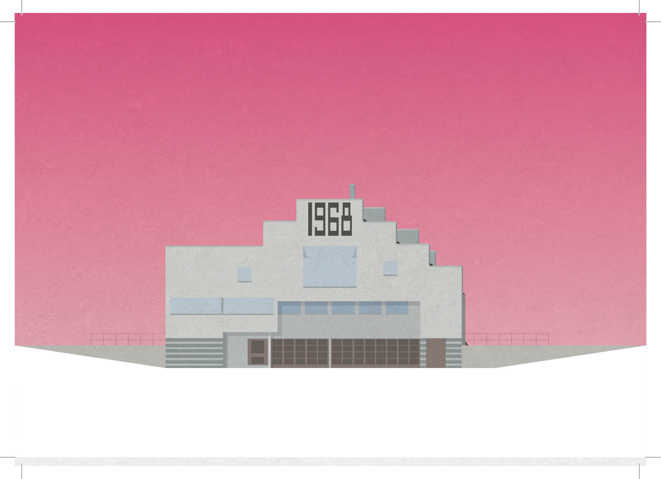
House in Vail
The House in Vail, CO, is proof that complexity and contradiction lead to ambiguity and richness of meaning. It consists of two different sorts of verticality: one articulated via the site context, the other contained by a sheer surface. North and south elevations are totally different, and the perception of the house from outside and inside is likewise contradictory. The scale of the roof and façade elements contributes to perceptual ambiguity- the real height is never directly revealed. Inside, depending on the height at which the observer is positioned, the house is perceived as either a tower or a small studio. By playing on this characteristic, while keeping the Tokyo context in mind, our new proposal suggests a building, divided into two parts, with mixed functions linked by an out of scale stair and a bridge that also inflates the perceived scale.
From the road, the entry is ambiguous, for there is no door in the main façade. Instead, it is located at the back. On the front left-hand side, a big stair emerges and continues along the whole site, as well as inside the building. It is the connection between the single parts of the house and its more unified surface that make it a whole. The outside is a semi-public space. Also, the way in which each external part is expressed separately does not encourage any visual connection with what is going on inside.
The difference between the House in Vail and our de sign lies in the act of traversal. In the former, the occupant or visitor must decide whether to take the stairs or the bridge. The new design proposes an architectural promenade, using both these elements as a continuous passage though the site. Robert Venturi’s so-called inclusive design method has promoted our understanding of the design and its articulation.
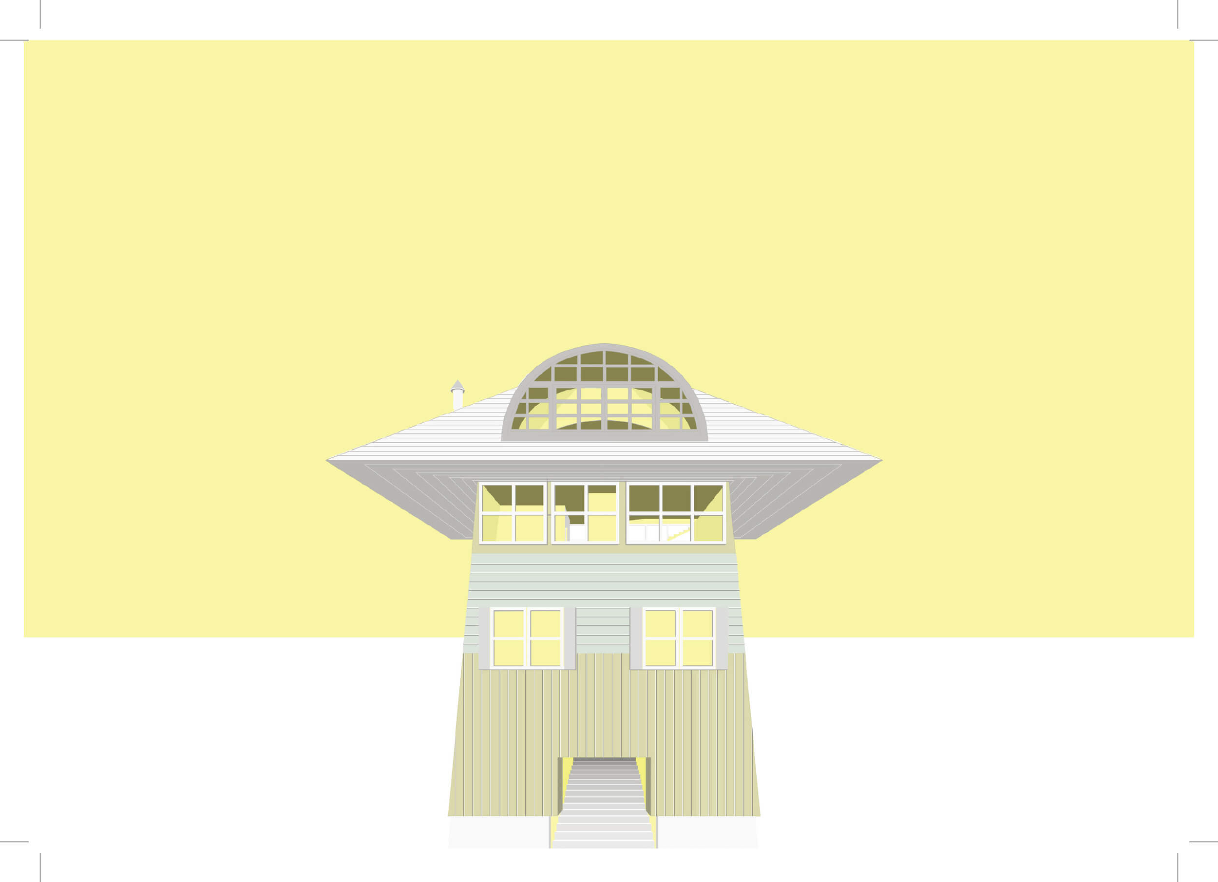
Vanna Venturi House
Our house is difficult to explain in terms of a single clear idea, just like the Vanna Venturi House in Chestnut Hill, PA. Since the original site is wooded, while our project is situated in a dense urban area, we tried to adapt the plan to this new situation, In order to follow the pattern of the traditional Japanese machiya, we established the short side of the building as its main facade. But the entrance still maintains the character of Venturi’s mother’s house, in terms of its circulation, with the staircase and most of the doors close to the entrance.
Carlos Beires House
The Casa Carlos Bereiras is a most ambivalent building. While partly hidden behind fragile walls on the street sides, the facade tends to dissolve the volume, mostly by the fractured windows, all set at a slight angle.
On the side facing the neighbors, the apparent volume is increased by a wall on top of the building – but with nothing behind it. The circulation within the building is merely a sequence of rooms.
We mainly kept the layout, since we liked it. But we tried to adapt the heavy materials and construction to fit a more Japanese environment.
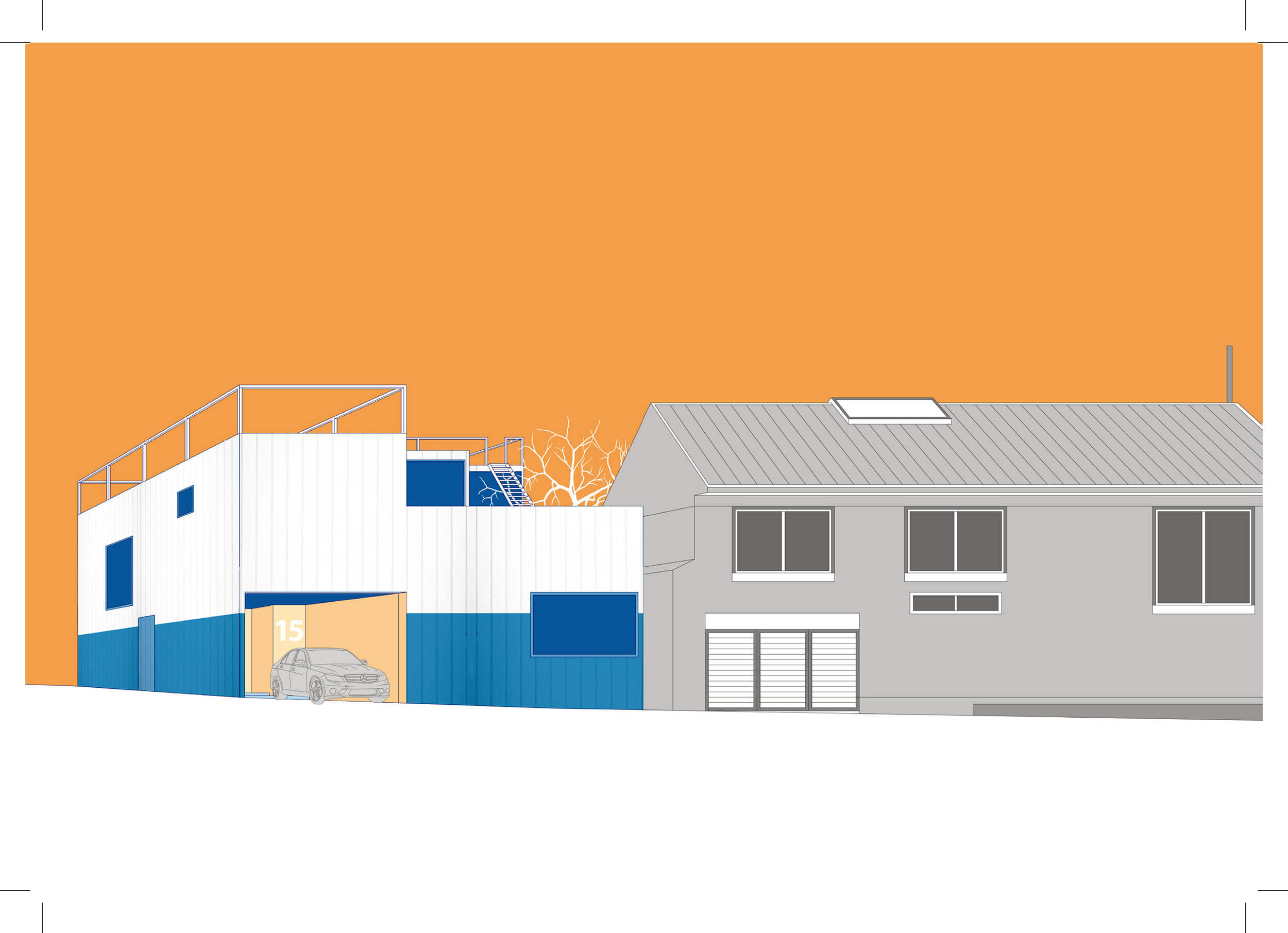
D’Agostino House
This is a house with two entrances and a shortcut, situated between an iconic townhouse and a parking lot. Related solely to its neighbor and to Venturi’s large, unrealized D’Agostino House, we opened for a linear tripartite sequence – front garden, living space, and utilities – in which one moves from automotive urbanity to the innermost sanctuary of the human dwelling.
The garden hides behind a façade that nods to its neighbor and whose mere existence is a Venturian feature. You park the car and advance diagonally to the subtle front entrance.
The living space is a large cubic space. Its direction changes abruptly and dramatically breaks up the linearity of the scheme. One glides upward via a broad stair, into the light that flows down from the large windows above.
From here, one moves either up to a second floor bed room or down to the kitchen, from which you may also jpg B escape via a backdoor.
Lieb House
We drew two perspectives. One of these reveals the surroundings: just as the original beach location of the Lieb House brought home the project’s tenuous position on the sand, our perspective attempts to convey our project’s relationship to the urban environment. This strategy allows the viewer to understand the proportions of the urban fabric. Our other perspective focuses on the house, and reveals the deep opening into its facade. This design decision architecturally juxtaposes the neighboring house’s garage entrance, and initiates a conversation between our proposal and the rhythms of the site. Furthermore, these perspectives incorporate the new order imposed by our site on the Lieb House, and how we interpreted this architecturally.
The Lieb House features a stair that cut through it, linking the beach directly with the living space above. Bedrooms and bathrooms cluster around a central hall on the first floor. The architect points to this contrast between the two levels by painting the facade in two colors. Even so, the paint line doesn’t line up with the floor plate, but just bifurcates the facade. In our proposal we drew from these ideas and decide to incorporate a similar open space above with an urban garden terrace, then rearrange the bottom floor to allow for parking and small garden. This creates a link with the neighbors to form a shared semi-private outdoor space.